Introduction to Geovisualization Portfolio GEOG 5540
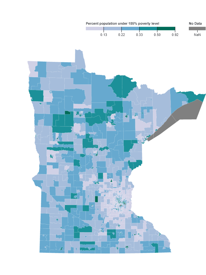
Percent Poverty in Minnesota
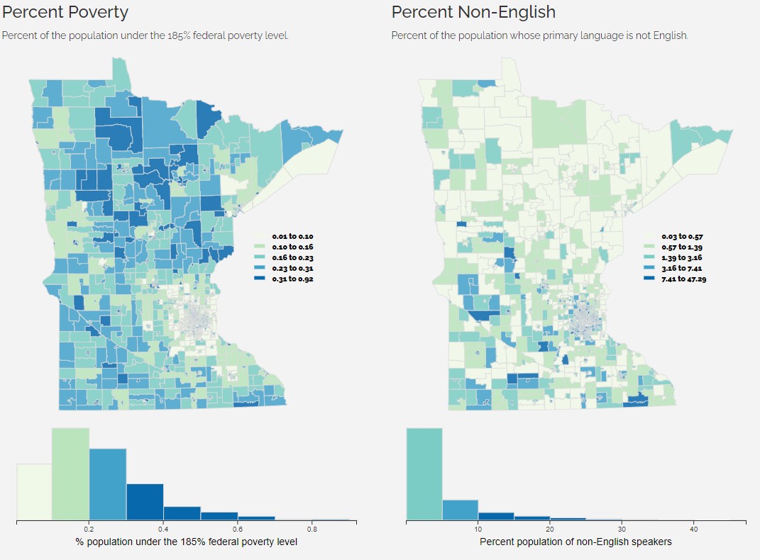
This choropleth map demonstrates a heterogenous spatial distribution of percent poverty across the entire state of Minnesota. The most noticeable pattern is the ring of light purple, representing the lowest percentage of poverty, around the Twin Cities.
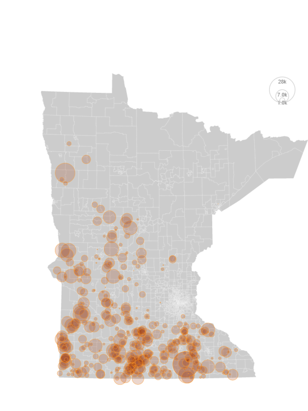
Counts of hogs over 300lb in MN CAFOs
This proportional symbols map visualizes the CAFOs (concentrated animal feeding operations) in Minnesota that are documented to house hogs that are greater than 300lbs. The majority of these CAFOs are located on the South and Southwest edge of the state.
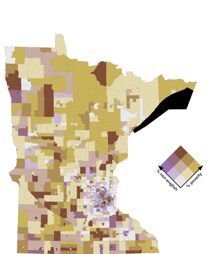
Percent poverty vs. Percent non-English speakers in Minnesota
In this bivariate map, areas of high poverty and high percentage of non-English speakers are shown as dark orange and areas of low poverty and low percentage of non-English speakers are shown as white.
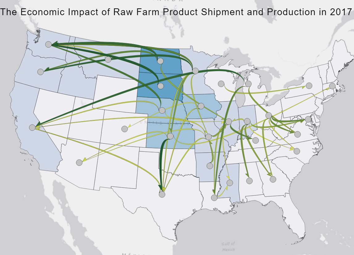
Economic Impacts of Raw Farm Product Shipments in the US
From this flowmap we can visualize the top 100 flows of raw farm products shipped within the United States over state lines. The overall pattern seen is that most larger flows are starting at the center of the US, in the midwestern region, traveling towards the coastal areas.
Environmental Justice Factors in Minnesota
A grid of four small multiple maps illustrates the spatial distribution of the evironmental justice factors including proportion poverty, percent non-English speakers proportion minority, and swine density in Minnesota census tracts.
Final Project Proposal: The Midwest Swine Invasion
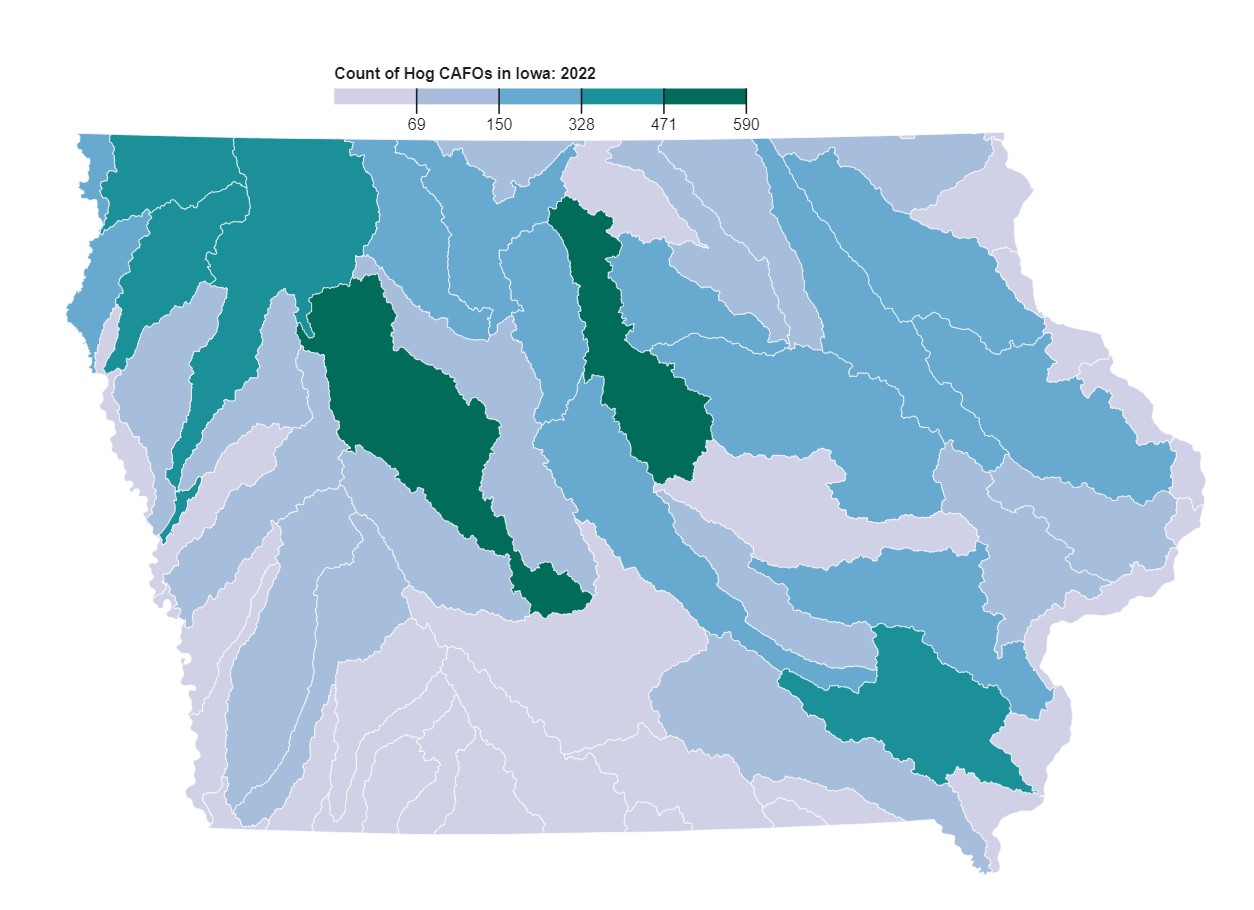
The observable webpage for my proposed final project investigating the temporal changes in swine population, E.coli concentration, and antibiotic levels in Iowa watersheds.