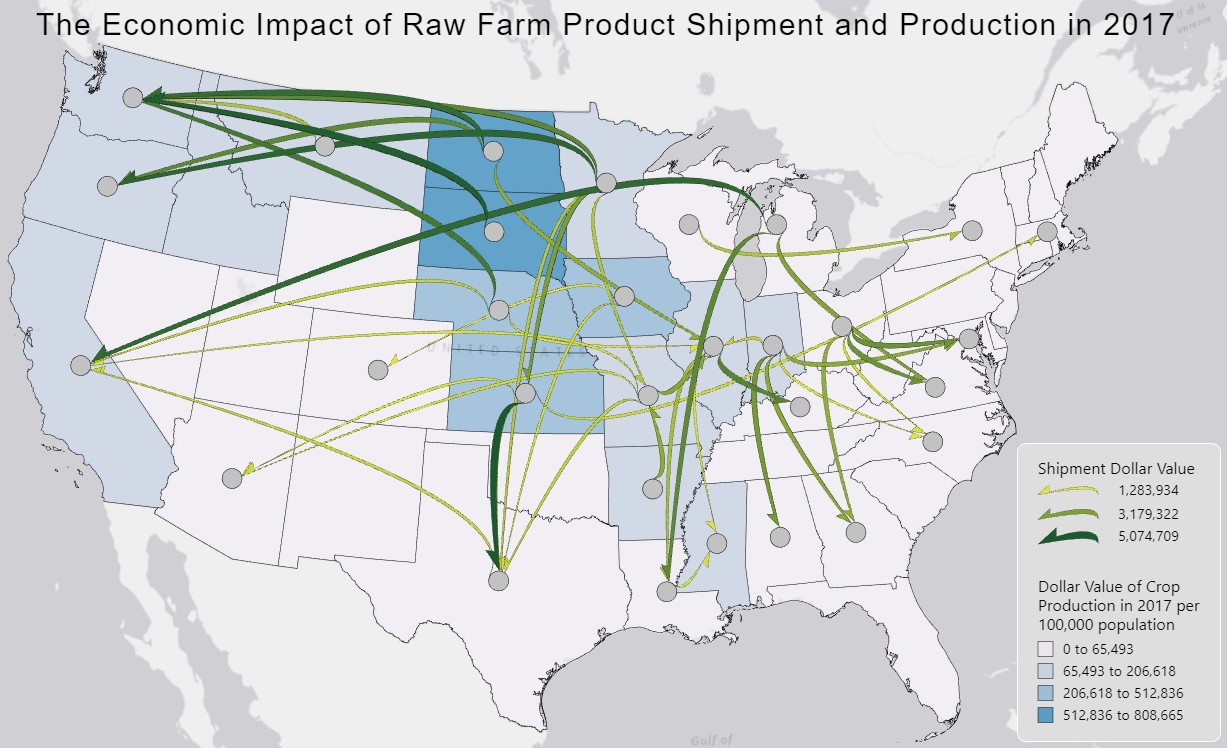
Flow Map: Economic Impact of Raw Farm Product Shipments in the US

Justification of the flow map design:
The symbology chosen to visualize the flow data was a curved half-arrow. This was chosen due to the two main tasks I wanted my flow map to perform. The first being to show the dominant direction of flows, and the second to show clusters of net-exporters. Based on a user study by Koylu & Guo (2016), there are specific symbologies that perform best for specific tasks. To show dominant direction, they found that a monotone arrowhead outperformed all other options. However, they also found through logistic regression that a faded or divergent arrowhead outperformed a tapered or teardrop symbology. To best show clusters of net-exporters, they found that faded arrowheads and teardrops resulted in the most accurate and timely responses. From these study results, the ideal choice to complete these two tasks most effectively would be a faded arrowhead. This was not an option on Flowmapper, so I instead chose to use a curved half-arrow. This was chosen over the teardrop symbology because the main task I wanted this map to achieve was to show the directionality of these transportations. In addition to the symbology for the flows, the color choices and stroke were also adjusted. I chose the colors of yellow to green to display three categories of dollar values for each shipment. The higher valued shipments were darker green, making them more visible on the map as important flows. The stroke color was also changed to black. This was done to accentuate the lighter, thinner flows. When the stroke was white, it was more difficult to see these less visually salient flows due to the background also being lighter. Additionally, the color choice for the background choropleth map was chosen to be shades of blue. This was chosen because of its contrast with the lighter green/yellow color used to display the thinnest flows, which against the blue colors became more easily visible.
Interpretation of flow patterns:
From this map we can visualize the top 100 flows of raw farm products shipped within the United States over state lines. The overall pattern seen is that most larger flows are starting at the center of the US, in the midwestern region, traveling towards the coastal areas. A cluster of high value shipments are seen in the Northwestern corner, with origins in several midwestern states and destinations to Washington and Oregon. There are also several flows from the Midwest to California, Texas, and the Eastern coastal states. Although most of these coastal areas receive most of their shipments from the nearer midwestern states, the state of Michigan specifically looks to have two rather long flows to California and Louisiana. This may suggest that there is a farm commodity grown in Michigan that is in high demand in these states and are not available from states that are closer in distance. The choropleth map matches the flow data well, showing a darker cluster of high dollar values from crop production in the midwestern region where most flows initiate from. More specifically, North and South Dakota are the two states with the highest crop production value and have some of the shipments with the highest dollar values as well. Additionally, except for California, Washington, and Oregon, almost all the coastal states have the lowest crop production values, indicating that they don’t have much revenue from crop farming and instead ship most of their raw products in. However, it is surprising that Michigan is within the lowest category for dollar value of crop production since there are several larger flows initiating from the state. Since this attribute was normalized based on population, their crop yield may not be proportional to their total population.