Geovisualization Portfolio GEOG:3540
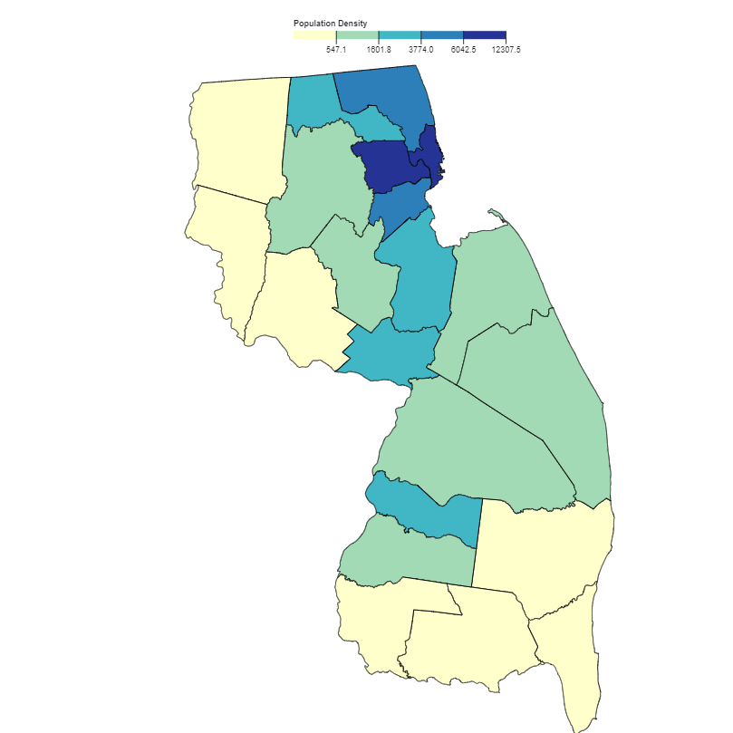
Population Density
Population density of New Jersey at the county level. Data is based off of 2010 census information. Even thoough there are areas of heavy density, they are usually part of a larger metro area like New York City.
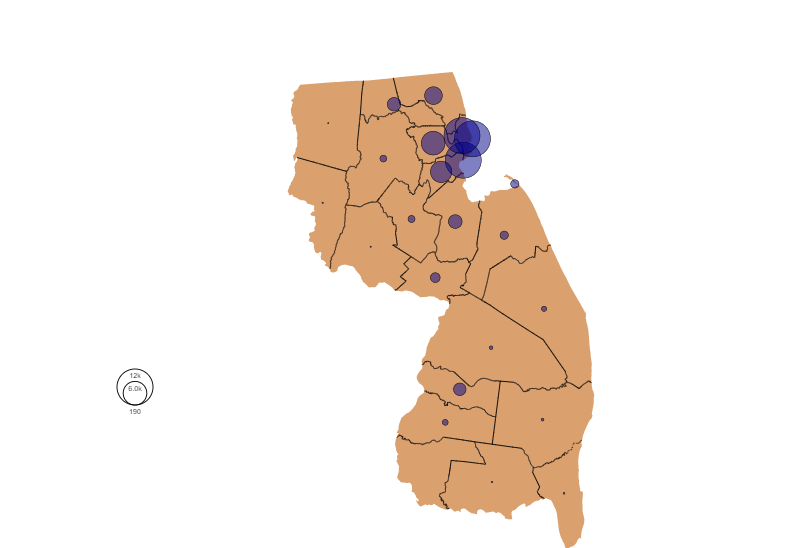
Point Symbol Mapping
Point symbol map representing population density. The gap between the largest observation (12,000/sqMile), and the smallest (>100/sqMile) is so large that the legend cannot visualize the smallest value.
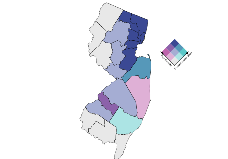
Bivariate Map
Map comparing population density with contaminated sites. These variables are strongly correlated so we see few examples of high density/low contaminated sites and vice versa.
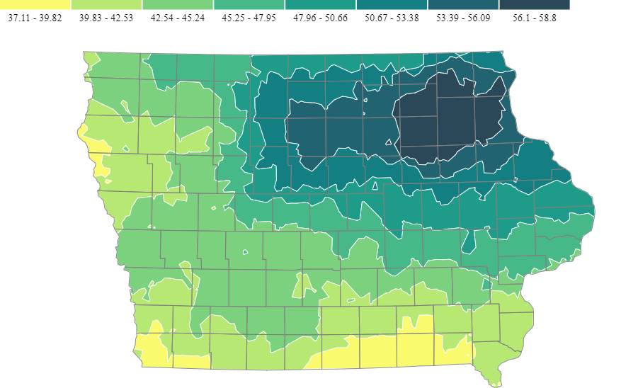
Isarithmic
This map looks at the state of Iowa and shows us total annual rainfall for different parts of the state. Norhteast Iowa is surpisingly dense, receiving almost 20 more inches on averages than the southern counties.
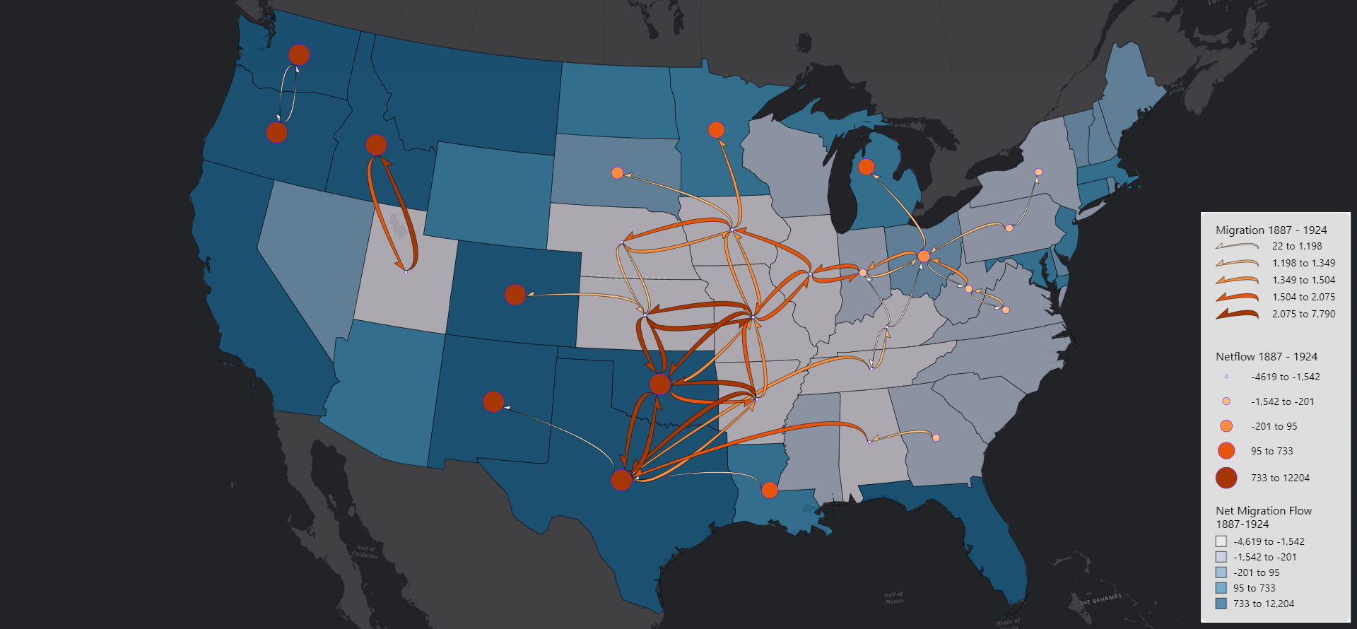
Flow Map
This is a map visualizing the flow of migration from the year 1887 to 1924. This only highlights the top 50 flows, including more than that has some severe overlap and becomes confusing to look at. Regardless, there is plenty to analyze here. We can see a large exodus from the midwestern states to the border states like Minnesota, Texas, New Mexico and even Louisiana.
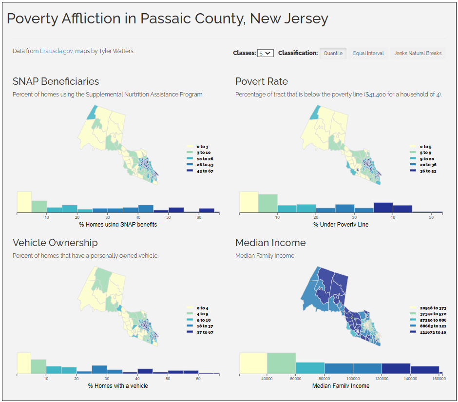
Poverty in Passaic
Quick analysis of poverty in Passaic County, New Jersey. We can see strong correlation between SNAP beneficiaries and those impoverished, yet those clusters are the ones with higher rates of vehicle ownership.
Final Project
Final Project for GEOG 3540, releasing soon.