Agricultural Runoff in the United States Bennett Cournoyer
Introduction
The Midwest of the United States is often shielded from effects of climate change. There are few major cities polluting the environment. Vegetation for miles of corn and soybean fields gives the illusion of a bountiful garden. But this garden is fueled by a poison, and it is polluting the ocean just as much as us Midwesterners accuse the coastal cities of doing. Industrial agriculture is relying on toxic pesticides, herbicides, and fertilizers that runoff into our streams, rivers, and eventually oceans. These chemicals often contain elements like Nitrogen, Phosphorus, Potassium, Zinc, Magnesium, and Sulfur in concentrations that are toxic to the environment. The goal of this project is to visualize the effect that agricultural runoff in the continental US contributes to a hypoxic zone in the Gulf of Mexico. Nitrogen and Phosphorus were chosen specifically because of their contributions to the mechanics of how the Hypoxic zone forms. Nitrogen and phosphorus contaminate the Gulf, creating optimal conditions for algae growth near the mouth of the Mississippi River. This alga metabolizes all the oxygen in the water, eventually killing itself, and leaving an oxygen free environment in the surrounding water. This is an important concept for our Midwestern agricultural states to understand. Being the major polluters, our states can work to prevent runoff and become more carbon neutral. The oceans absorb 30-50% of all carbon dioxide emissions annually. This is a problem all agricultural states must face as it is an obstacle to truly renewable farming practices.
Research Questions
Where in the US are the major producers of Nitrogen and Phosphorus runoff? Where does Iowa rank as a polluter of Nitrogen and Phosphorus? How large is the Hypoxic Zone in the Gulf of Mexico? Where does surface water drain in the US?
Data
Data for this project came from the USDA's MANAGE(MEasured Annual Nutrient loads frome AGricultural Environments database). This database had county level data for nitrogen and phosphorus runoff for 2006. Data from the Gulf of Mexico Data Atlas includes a grid map of the dissolved oxygen in the Hypoxic Zone. The flow map uses HU2 (Hydrologic Unit) data from the USGS as a part of their Watershed Boundary Dataset. I joined these files with the United States County data to normalize the variables in each column. Some outliers were removed from the data due to them stretching the legends too far. These inlude several large counties in Washington and California. These counties have many crops not grown in other areas of the US, which create more runoff. These counties are also enourmous compared to counties in Iowa.
Methods
I chose a choropleth and bivariate choropleth map to visualize the runoff. US county data is easy to visualize the regional trends. The data is easily normalized with census data. The bivariate choropleth map is designed to show the overlap of phosphorus and nitrogen in the US, highlighting agricultural centers in the Midwest. The flow map was chosen to visualize each drainage in the United States. Flow mapping also show where areas of the US drain into.
Maps
Iowa's Nitrogen Runoff
This map shows a the kilograms of Nitrogen runoff per square kilometer for each county in Iowa. There is one small cluster in south central Iowa with higher Nitrogen Runoff
United States Nitrgen Runoff by county.
This map shows the kg/km^2 of Nitrogen runoff in the US for each county. Counties in black either had no data, or were extreme outliers, removed to preserve the overall trend. Future work on this map should include a logisitic scale to map these outlying counties. The Pacific coast had a number of counties removed due to unique crops being grown. These fields generate excess runoff compared to corn or soybeans. The goal of this map is to convey the high nitrogen runoff rate in the Midwest. This will be important later when showing where the Midwest's water drains to.
US County Nitrogen and Phosphorus Runoff
This is the bivariate visualization of nitrogen and phosphorus runoff in each county. Runoff was aggregated into 3 levels(low medium high) for the two variables for a total of 9 colors. The goal of this map was to visualize which runoff element was more prevelant around the US. The Midwest has much higher rates of Phosphorus polllution than nitrogen. Southeastern states favor Nitrogen. The intended goal of this map was to show that the high levels of pollution are not just localized to a few elements. There is more data on other forms of agricultural runoff. Mapping other elements would show the same trend were seeing here.
There is a clear trend of Midwestern states leading the US in Phosphorus and Nitrogen runoff. This is an important trend because of the image below.

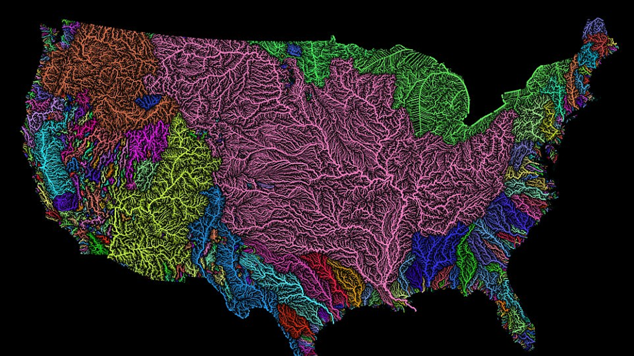
This shows the main waterbasins in the US. A water basin is a collection of rivers and arterial waterways that all drain to the same point. The Mississippi water basin is in pink and is the largest in the continental US. This compounds the problem with runoff because the already high level of pollution. The whole region drains to the Gulf of Mexico through the Mississippi river in Louisiana. The Gulf of Mexico's shape plays a roll in this as well.
Gulf of Mexico Hypoxic Zone.
Each hexagon in this map represents a gridpoint reading of the current Hypoxic Zone in micromol/liter. The shape of the Gulf current takes the toxic runoff from Louisana and swirls it within the Gulf. The Gulf doesnt have as much volume or movemnent to dilute these pollutants as the Pacific Ocean. Thus, the entire US coast in the region is critically Hypoxic. The H3 resolution can change the symbol size in the map.

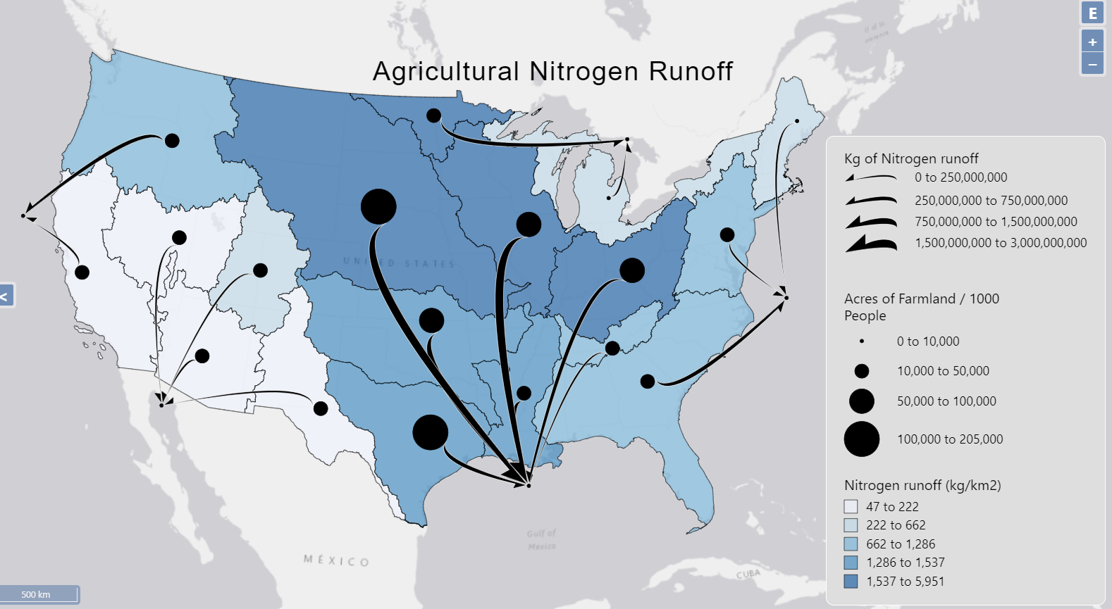
The final map is a flow map of the Nitrogen runoff and Farmland in the US. The choropleth data is divided into HU2 (Hydrologic Unit) measuring the kg/km2 of Nitrogen. Hydrolgic Units are smaller than water basins, but follow the same boundaries. Each Node represents the Acres of farmland per 1000 people in each HU2. The flow arrows represent the non normalized kg of nitrogen runoff. Each arrow starts at its HU2 and ends in the main body of water the waterbasin drains into. This map furthers the point that the Midwest pollutes the Gulf of Mexico far more than the bordering states.
Usability Survey
A usabiltiy survey was created through the UIowa Qualtircs Survey. Users were asked about the flowmap above. They were asked to comment on the perceieved spatial distribution, color, symbology, perceptual issues, and general comments about the map. The feedback was very helpful for future work on this map. I plan on submitting this for a map competitition and all comments were useful. Each respondent indicated the intedned perception of the map. There was some confusion about what a HU2 is. To fix this I plan to either map based on state or another sized region. Nitrogen runoff is a pollution index, therefore it was mentioned I could change the color scheme to reflect this. Further work on this map would include changing the basemap, changing the class breaks and symbol sizes, and bringing in more normalization to each variable. Each node is not in its geographic center of each HU2. Future work also includes using a polygon to point tool to center the nodes. Currently the nodes were guestimated when I entered their coordinates in the nodes file. One survey taker mentioned that the Gulf of Mexico was not the only body of water with Hypoxic Zones. The ocean nodes could reflect the location and size of these zones, giving visual meaning to the nodes in the ocean, furthering the maps intent. At the least I thought adding a layer to show the Hypoxic Zone would help. I would also like to change the nodes in the ocean. Water basins on the coasts of the country dont all flow to the same points, and there is probably a better place to put the water body nodes. Thankfully, for this map and the intended purpose, the trend of all ern HU2 draining to the same point is preserved. Eventually I would like to imbed flowmapper.org into this website and have the site automatically load the JSON file into flowmapper so the user could have more interaction.
Conclusion
The Midwest is responsible for a great majority of agricultural pollutants especially Nitrogen and Phosphorus. This problem is compounded by the size of the water basin draining into a body of water the size of the Gulf of Mexico. This slow moving current cannot diffuse pollutants rapidly enough. Therefore the excess nutrients fuel algae blooms that turn the Gulf of Mexico Hypoxic. A common sentiment in our region is that pollution and climate change aren't happening here. Pollution is not just located to big cities, climate change does't just effect the ice caps. Reducing agricultural runoff is a huge opportunity for the US to reduce its carbon footprint. The algae blooms fueled by the runoff go through regular blooming and dying periods. Even after one year of reduced runoff the Hypoxic Zone would begin to shrink. Iowa is in a position to create more sustainable farming technique that will have a lasting impact on the water quality in the US.