Geovisualization Portfolio GEOG:3540
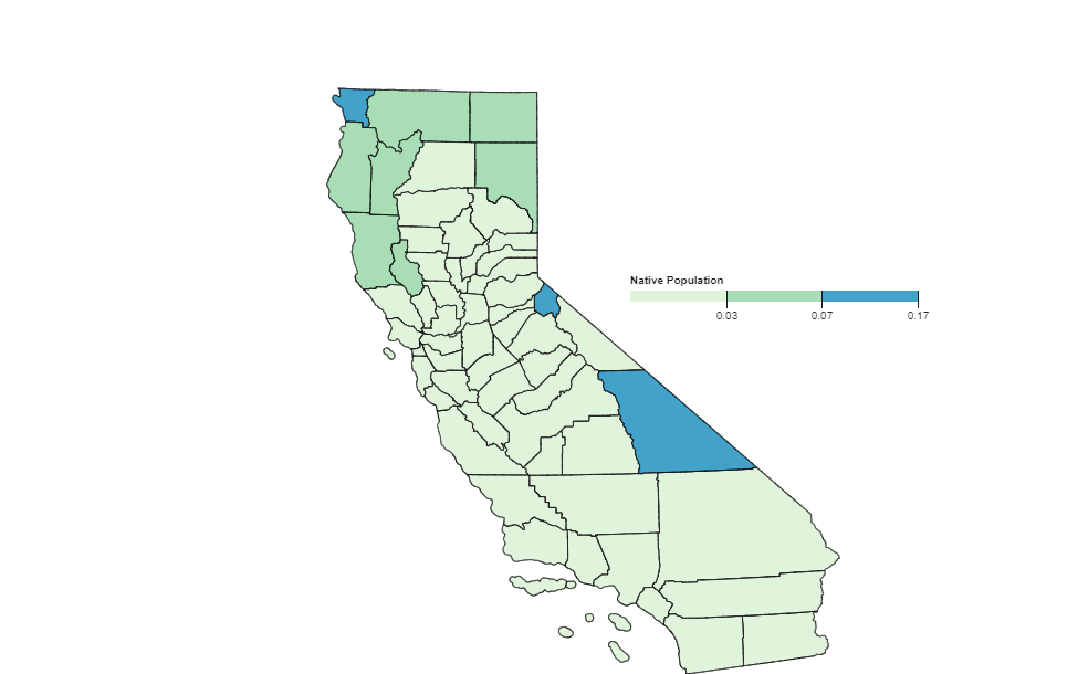
Choropleth Mapping: Native Population in California Counties
In this choropleth map, the depiction of the Native American population in the counties of California is visualized.
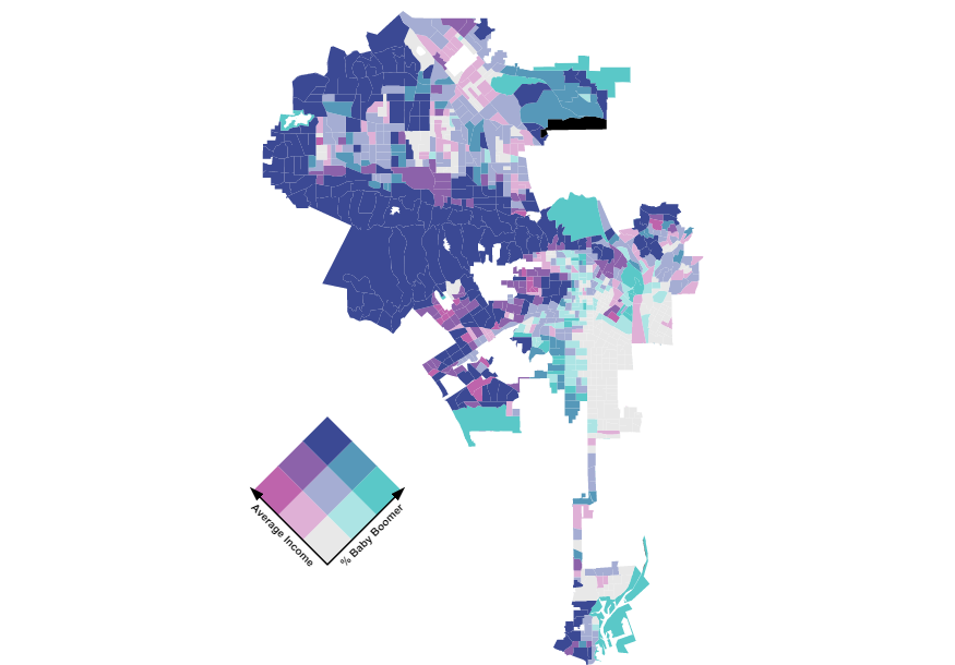
Bivariate Mapping: An Analysis of Average Income and the Baby Boomer in Los Angeles
This bivariate map depicts the relationship between the average household income and the block group's precentage of the generational class, Baby Boomers.
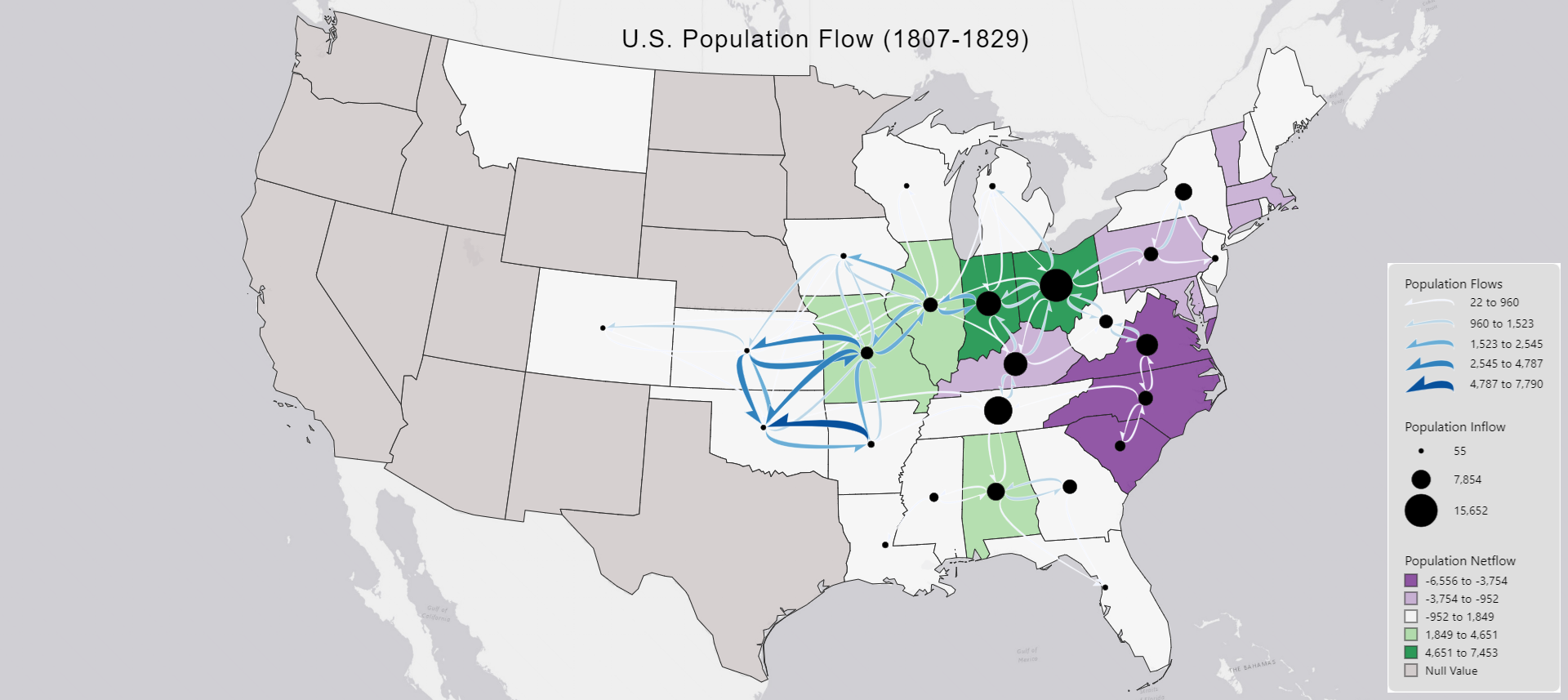
Flow Mapping
This flow map visualizes the population flows within the U.S. between the years of 1807 and 1829. Click the title for more information.
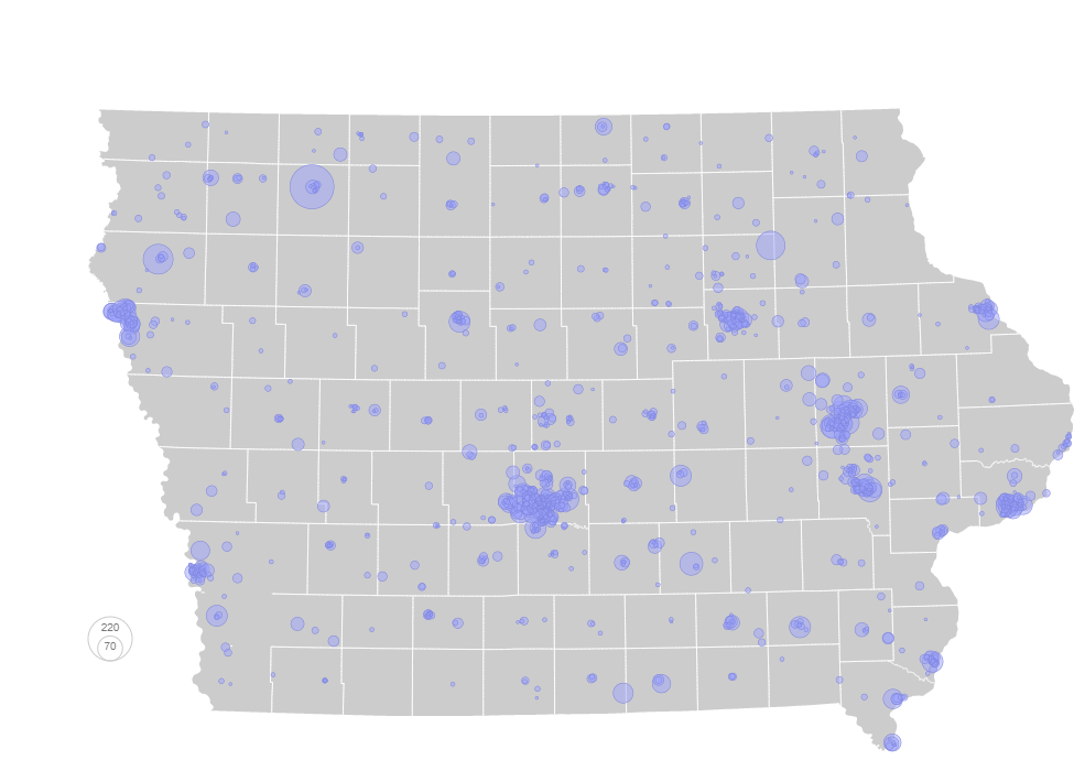
Proportional Symbol Mapping: Daycare Openings in Iowa (April 2023)
In this proportional symbol map, we can see the raw values of daycare openings.
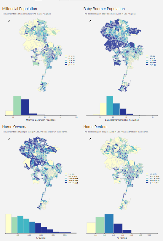
Small Multiples
In this small multiple map array, the populations of the millenial and baby boomer generations of Los Angeles are compared in tandem with the percentage of home owners who either rent or own their residence.

Pride Health Atlas
This is my final project for Geovisualization; it is an analysis on the drastic increase of anti-LGBTQ+ legislation and the effects it has on the LGBTQ+ community.
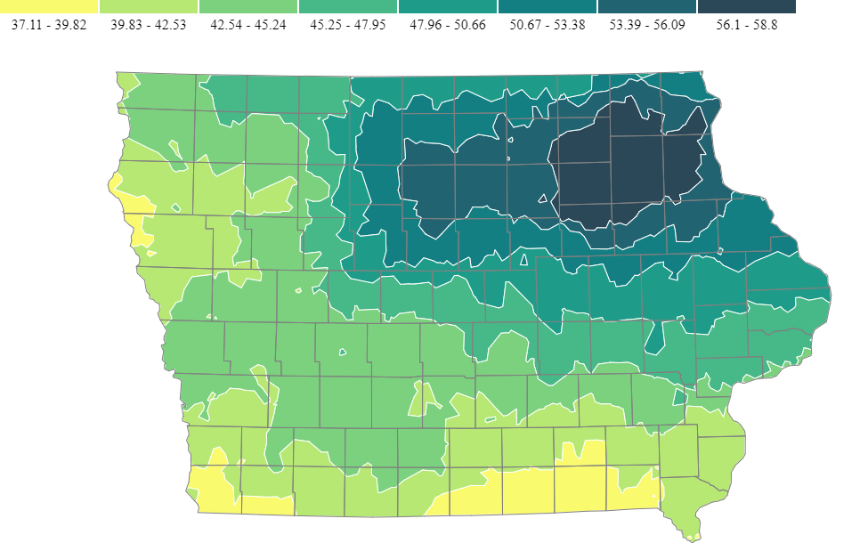
Isarithmic Map
Here is an example of an isarithmic map; not made by me. Added in order to fill out the portfolio as a requirement.