Flow Mapping Population Flows from 1807 to 1829

Here is a link to my exported .json file: Flow Mapper File Export
Color Scheme Justification:
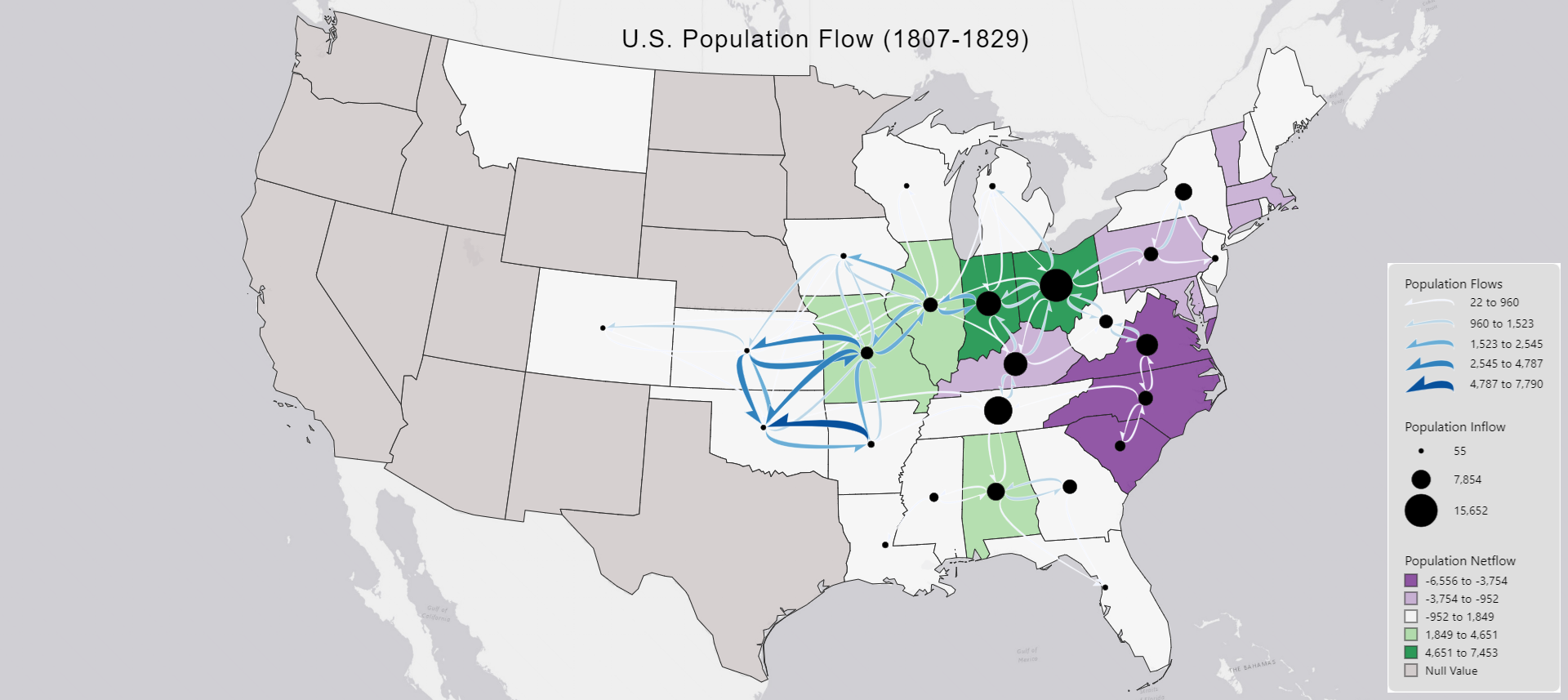
In my flow map, I chose to depict the population flow between the years of 1807-1829. For my choropleth base, I decided to utilize a divergent color scheme to represent the population net flow. I felt that a divergent color scheme was appropriate in terms of dividing up the different actions being portray here, such as purple representing a larger out flow and green representing a larger in flow. White can be seen as the “average” or “middle-ground” with not a lot of out flow, but not too much in flow; these white areas are not subject to much change within the time period. In terms of node symbology, I felt that there was not freedom, but I tried by best to find a reasonable minimum and maximum radius that was appropriate for the symbol. I made the minimum radius 3 as it didn’t make the symbol microscopic and hard to visualize, but it still conveyed that it was smaller value. Conversely, my decision to cap the maximum radius for the symbols at 20 was made looking that with the goal of having no overlap in mind—I did not want the symbols touching the borders of the states—Florida is an exception, however. The centroid happened to line up right along the state’s border. Finally, I chose to employ a blue-colored curved half arrow for my flow symbology. This is the step where I ran into the most problems. Since I utilized the colors green and purple for my choropleth map, I wanted to choose a color that would stand out against them both, so I chose blue—red was a contender, but I had to avoid it in consideration of any possible viewers being red-green color blind. However, the trade off I made here is that blue can often be overlooked if used for small components on a map, still I made the choice to implement it. The other issue that arose was the lesser values of the population flows, colored white, being hard to perceive against the white background of the choropleth map. I tried to implement a custom color scheme, but flow mapper would instead turn all the flows pitch black in response, so I kept the white to blue color scheme. However, I felt much more confident in my choice of implementing the curved half arrows; this visualization of flows has great results in terms of locating the dominant direction of the flow due to the design, which I felt was good addition to this map’s readability.
Map Interpretation:
We can see our largest areas of population inflow, depicted by the node symbols, are located within the states of Indiana, Ohio, Kentucky, and Tennessee. This is an interesting observation as while two out of those four states saw an overall positive net in flow during the time period, utilizing the choropleth data, we can see that Tennessee actually saw no major change in terms of its net flow, while Kentucky saw a minor out flow over the twenty-two year period. Furthermore, the east cost states of Virginia, North Carolina, and South Carolina all saw heavy out flow as visualized by their more saturated purple values. In contrast to the heavy out flow of the east, we see more green values—indicating higher in flow—in the west (at least more west than the original colonies), in states such as Missouri, Illinois, and the before-mentioned Ohio and Indiana. Moving our attention to the population flows, we can see that the state of Oklahoma received high amounts of in flow from surrounding states, as well as the state of Kansas.