Self Organizing Map: Visualization of Medical Providers and Population Demographics for Counties in the Midwest United States
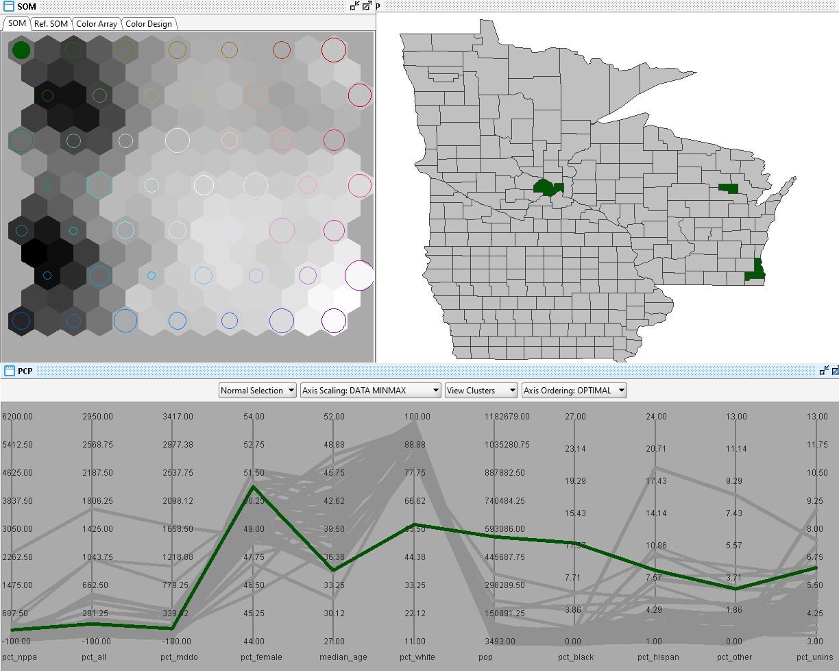
SomViz is a visualization tool that can be used to display and analyze multivariate data, by clustering data by groups that are similar across the variables. This map uses the somviz tool to identify clustering of mutliple variables including population size per square mile, race/ethnicity, median age, rate of providers by major categorization (physician, midlevel), and percent change of providers from 2015 to 2023. The order of the variables on the Parallel Coordinate Plot is organized by importants/ variables that drive the similarities/differences between the groupings. Then the magnitude of similarity among these clusters is represented over the grid system. Overall, the similar colors represent more similar clustering. In the grid, the color of plane (grey darkness/lightness) represents how dissimmilar the groups are from one another with darker being less similar than the hexagons around it. The size of the colored circles indicates the amount of counties that are within that color clustering.
- NPPA_chang: Percent change from 2015 - 2023 for midlevel providers (NPs and PAs)
- all_change: Percent change from 2015 - 2023 for all medical providers (MDs, DOs, NPs, and PAs)
- MDDO_chang: Percent change from 2015 - 2023 for physicians (MDs and DOs)
- pct_female: The percent of the population that is female according to the 2020 census
- median_age: The median age of the residents within each county
- pct_white: The percent of the population that identifies as white/nonhispanic according to the 2020 census
- population: The number of residents that reside in each county according to the 2020 census
- pct_black: The percent of the population that identifies as black according to the 2020 census
- pct_hispan: The percent of the population that identifies as hispanic according to the 2020 census
- pct_other: The percent of the population within each county that identifies as American Indian/Alaskan Native, Hawaiian/Pacific Islander, Asian, Multiple Races, or Other according to the 2020 census
- pct_uninsu: The percent of the population that does not have health insurance according to the 2020 census
Variables:
A walkthrough of comparison of major clusters is done below, allowing for comparison of certain attributes and patterns.
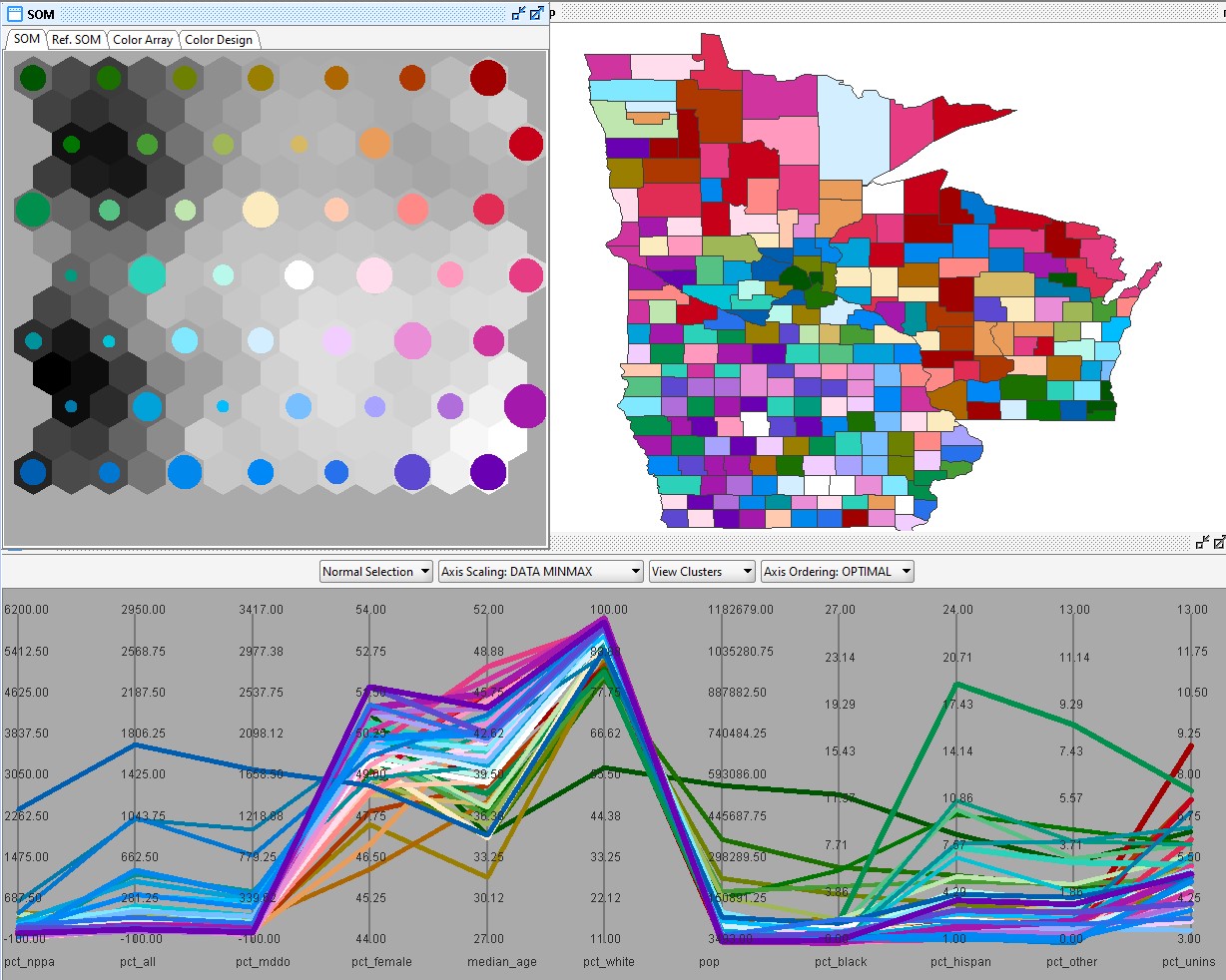
This map uses the somviz tool to identify clustering of mutliple variables including population size, race/ethnicity, median age, rate of providers by major categorization (physician, midlevel), and percent change of providers from 2015 to 2023.
Percent Change of Providers:
Clusters that represent the highest positive provider percentage growth over the years are seen in blue. Among these high positive growth, there appears to be more variation between the percentage of midlevel providers growth and the physician percent change. The clusters with some of the lowest, negative percent change over the 8 years of is seen in red. The declines appear to be happening in areas with higher percents of uninsured populations. Spatially, the highest rates of provider growth appear to be in the suburbs outside of St. Paul and Minneapolis and a cluster in northern Wisconsin. The declining rates of provider changes are located in the north central counties of Minnesota and on the western side of Wisconsin. Iowa does not fall much on either of these extremes.
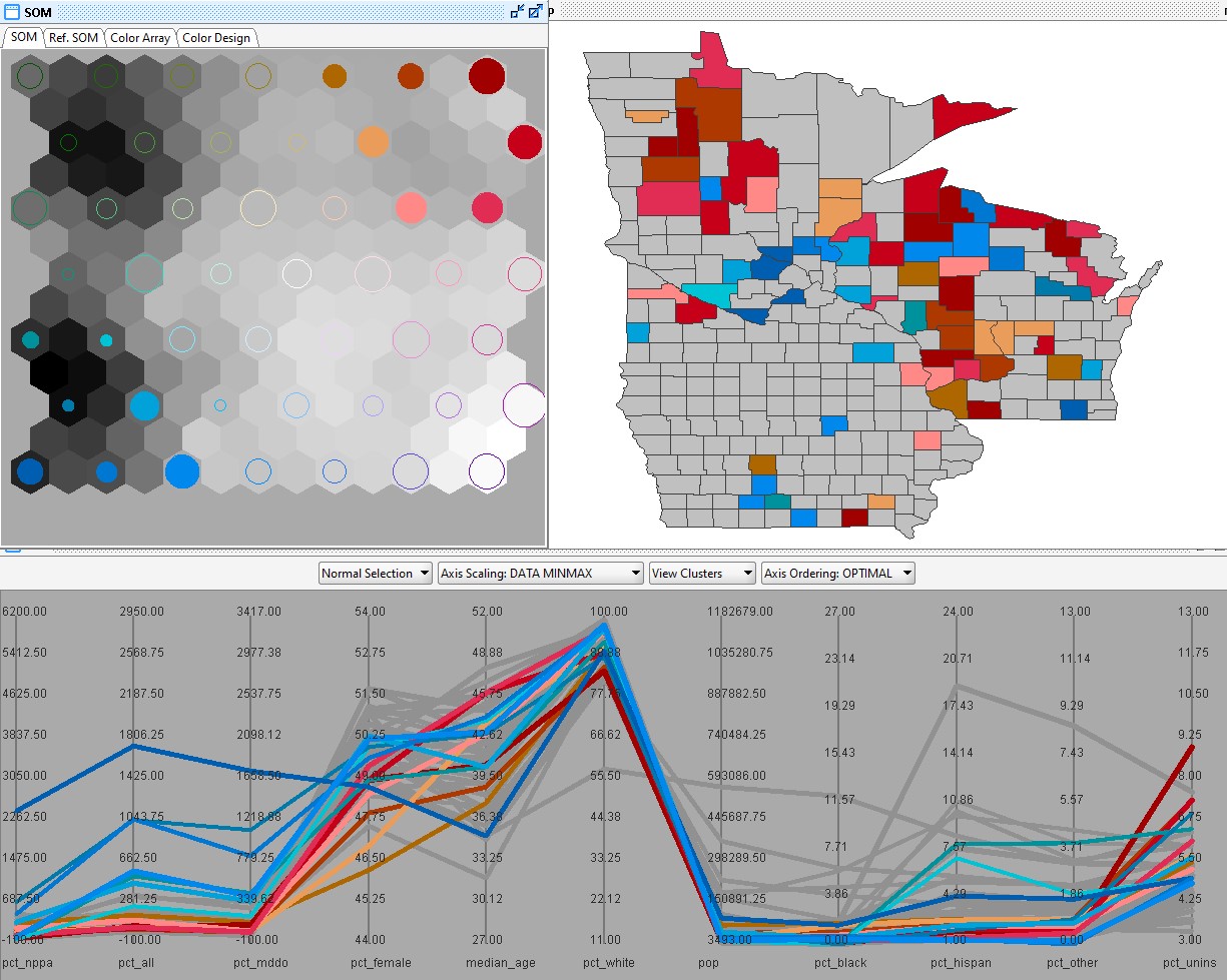
This map uses the somviz tool to show both the highest and lowest provider percent changes according to the percent of all medical providers change from 2015 to 2023.
High Provider Growth:
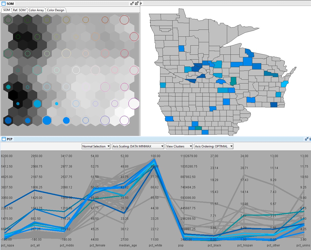
This map uses the somviz tool to show only the highest provider percent changes according to the percent of all medical providers change from 2015 to 2023. This shows the reader how the blue clusters compare across the other variables that contruibtue to the clustering.
Low Population Size Clusters
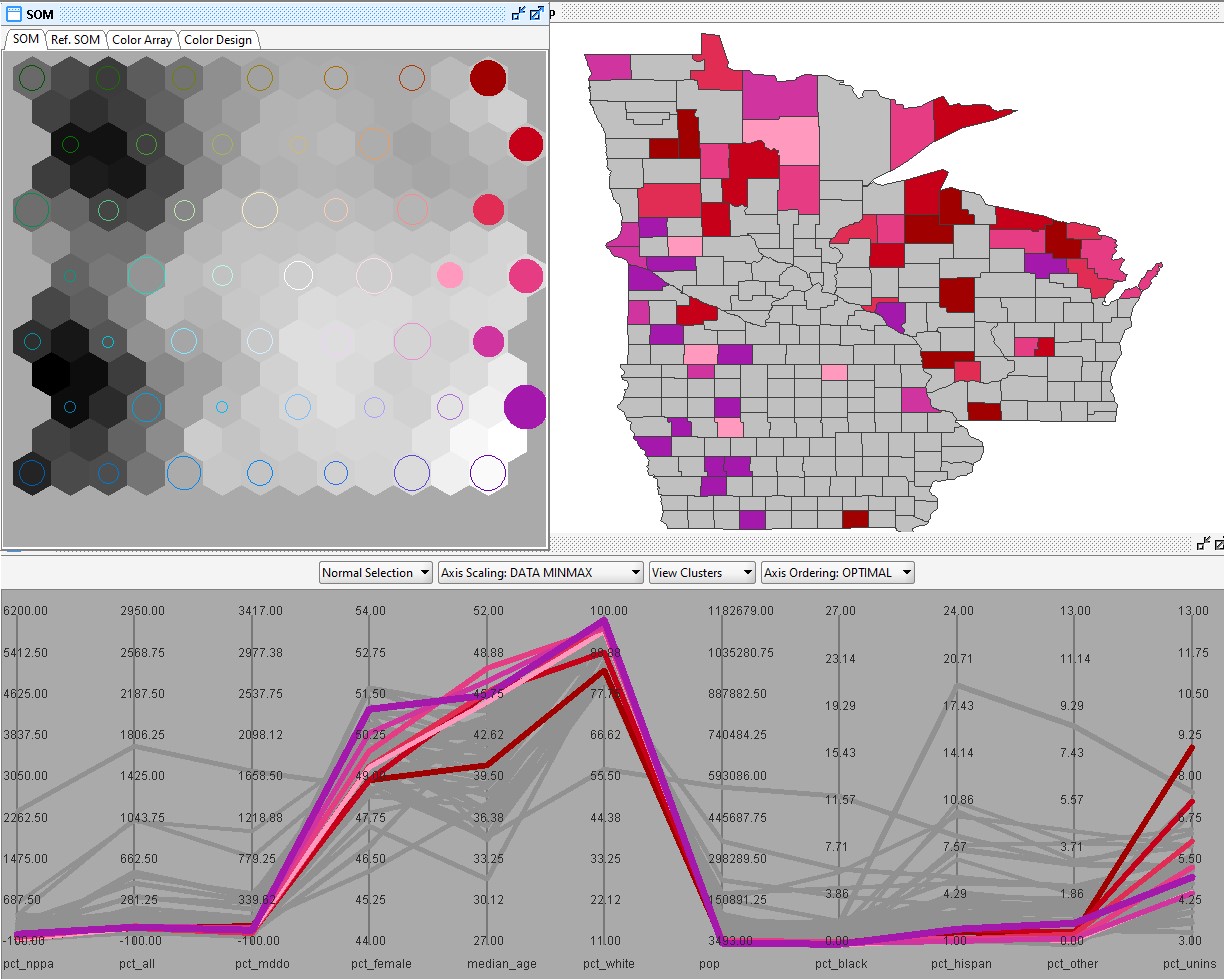
Since previous studies has found that population size and rurality plays a role in the movement of providers and the rate of change, the examination of the clusters with the highest and lowest population sizes were examined. The pink and red clusters appear to represent the counties with the lowest population sizes. This makes sence that it has a lower provider growth/decline in these areas. It is difficult to tell according to the chart if theres areas are declining or increasing with a small percentage over the 8 years since the range for the provider change variables are so large. These areas' demographics are what we expect for rural areas including some variability in the percent of uninsured persons but do have typically low minority populations, and have higher median age. Spatially, these clusters are in the northern part of Minnesota and Wisconsin and along the central west portion of Iowa.
High Population Size Clusters
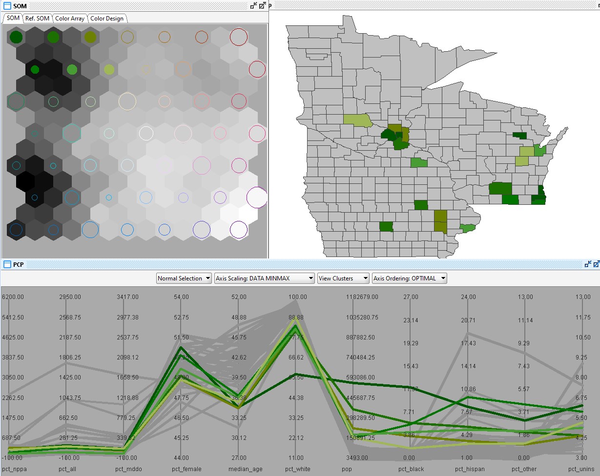
The map below shows the counties chosen for the largest populations. These appear to have lower provider percent changes, which is expected given the large numbers of providers in the area so losing/gaining a small number will do little to the percent change. This cluster has larger portions of minority populations including black, hispanic, and other populations, and have some of the lowest rates of median age. This cluster does have the percentage of uninsured around the middle range of the variable. Spatially, these clusters are around the large cities and academic centers of these three states including, Minneapolis/St. Paul in Minnesota, Milwaukee in Wisconsin, Des Moines, Iowa City and Cedar Rapids in Iowa.
High Percent of White Population
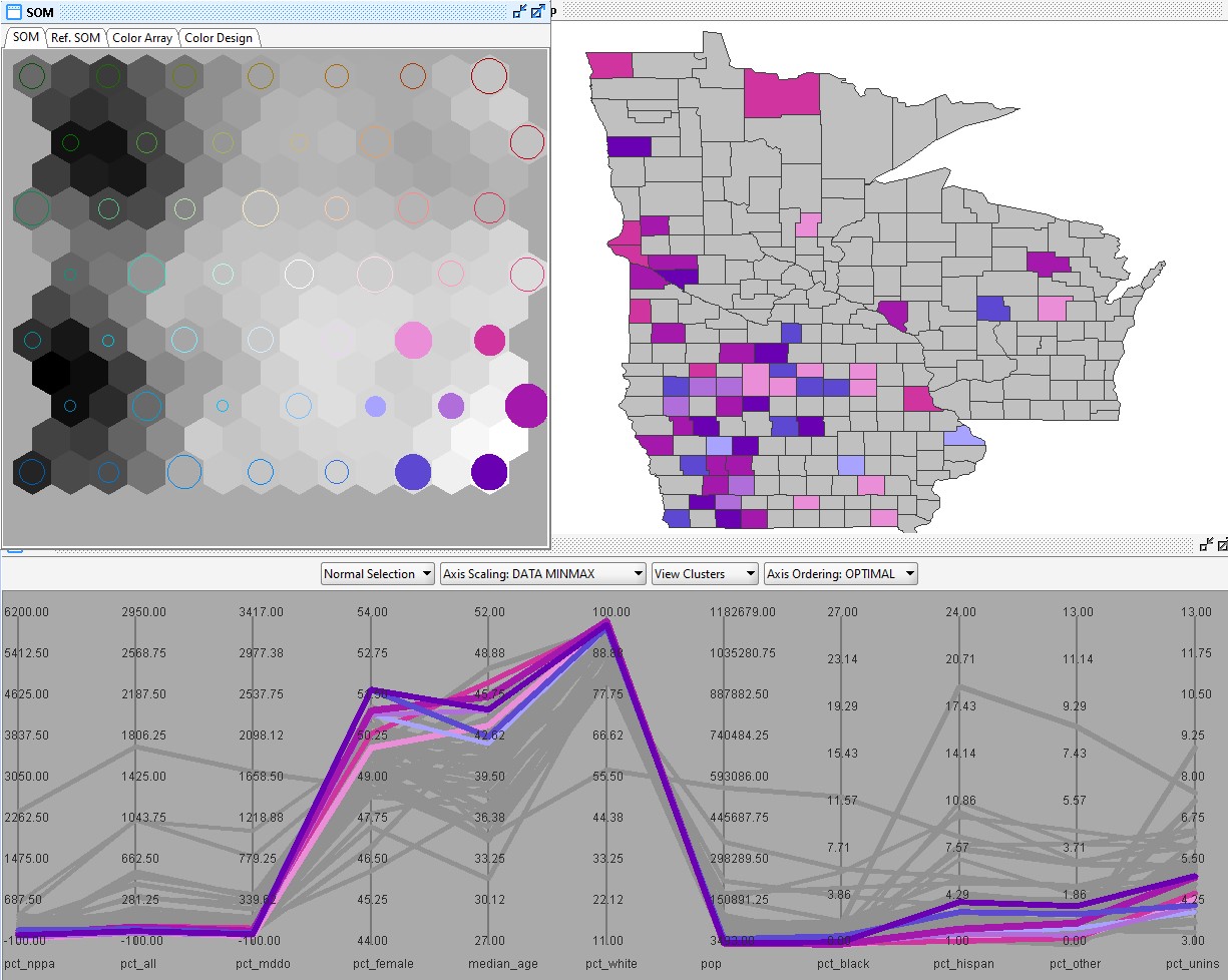
The Somviz results for the clusters with the highest percent of white population are represented in the purple categories. Spatially, these are in the rural, central counties in Iowa and on the south west portion of Minnesota. This cluster is similar to the patterns along the coordinate plot that we saw when examining the low population size cluster. This makes sense and can be seen in the hexagon grid, because the plane is similar all across the red/pink/purple cluster groups on the right side, we can understand that these clusters have similar patterns between these groups.
Low Percent of White Population
The Somviz results for the cluster with the lowest percent of white population is represented in the farthest green corner. Spatially, these are the counties in the main major cities of Minneapolis and Milwaukee. This has the highest percent black population as well. While this group is within the green cluster, the difference in race makeup of these counties likely drive the difference between the green cluster groups. This can be seen in the grid of hexagons having a lot of variability in darkness in the plane.
