Scatterplots: COVID-19 Vulnerabilities by County in the U.S.

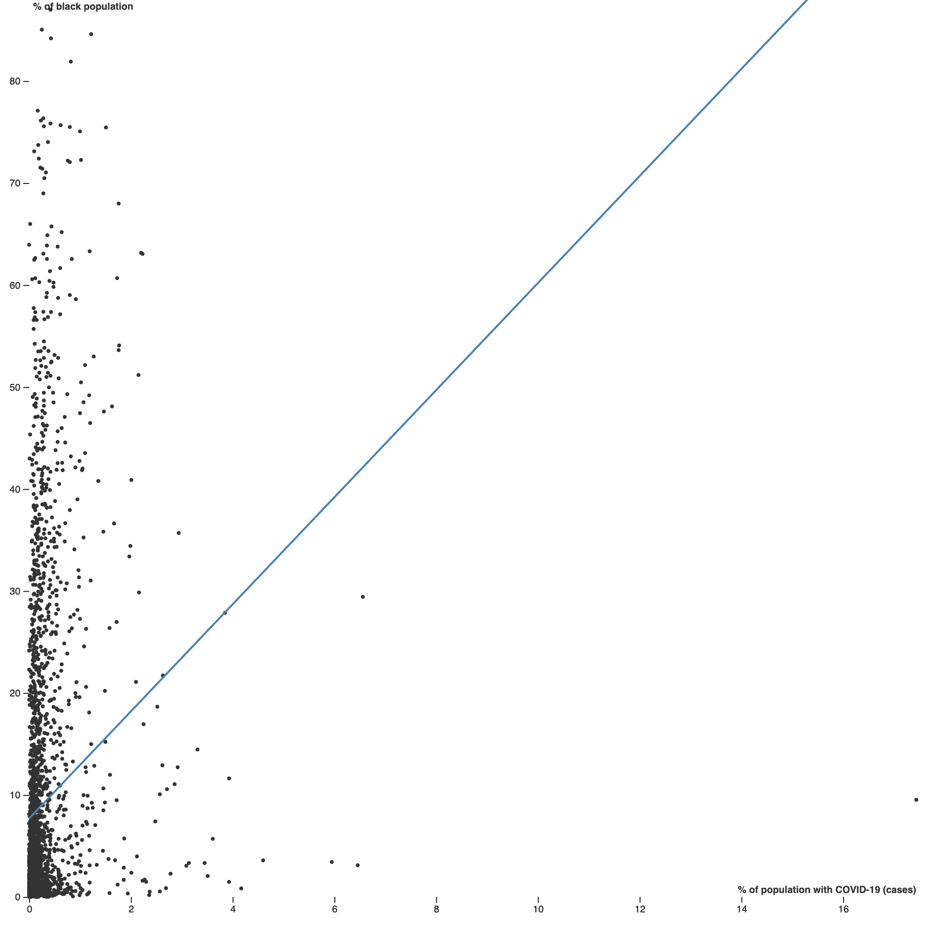
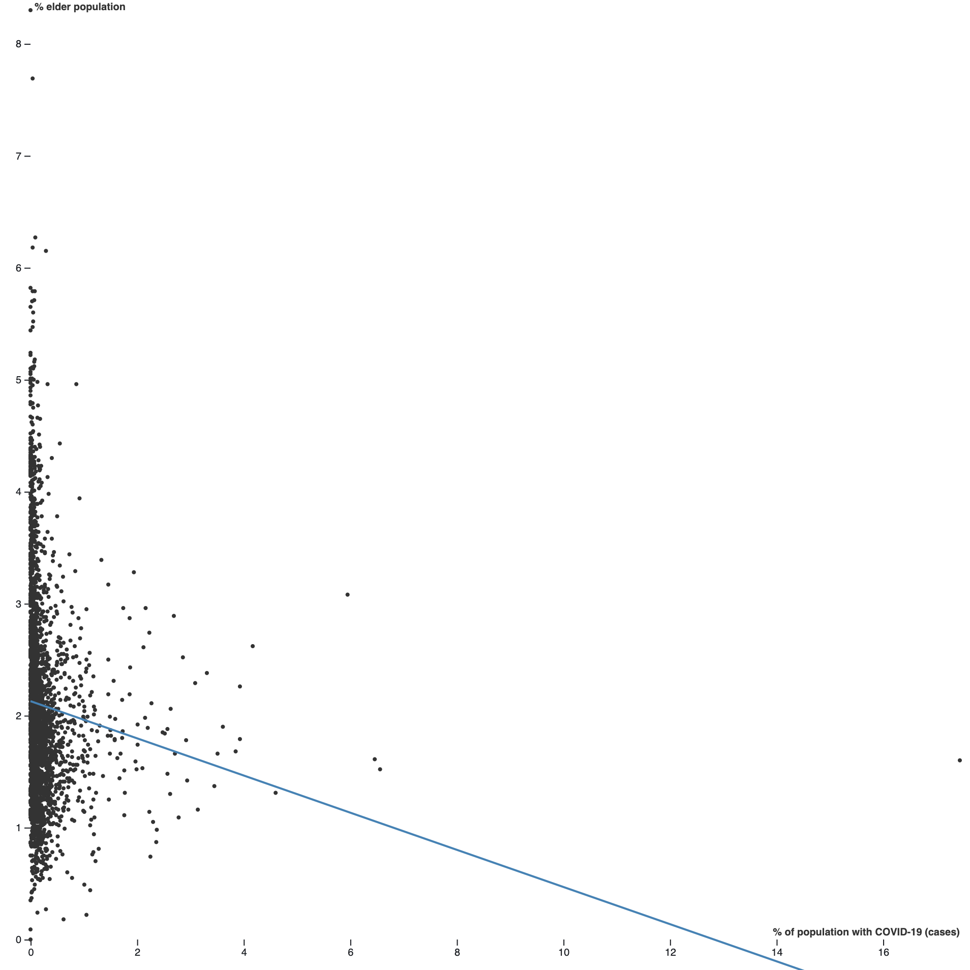
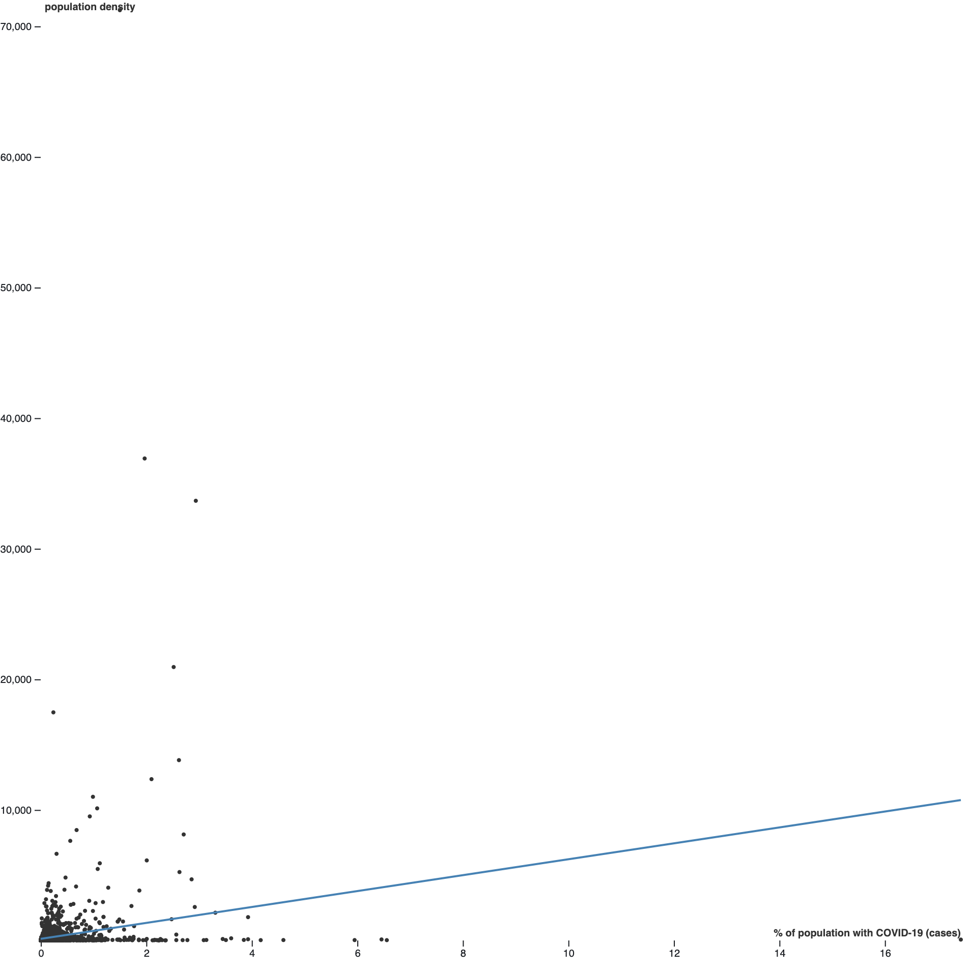
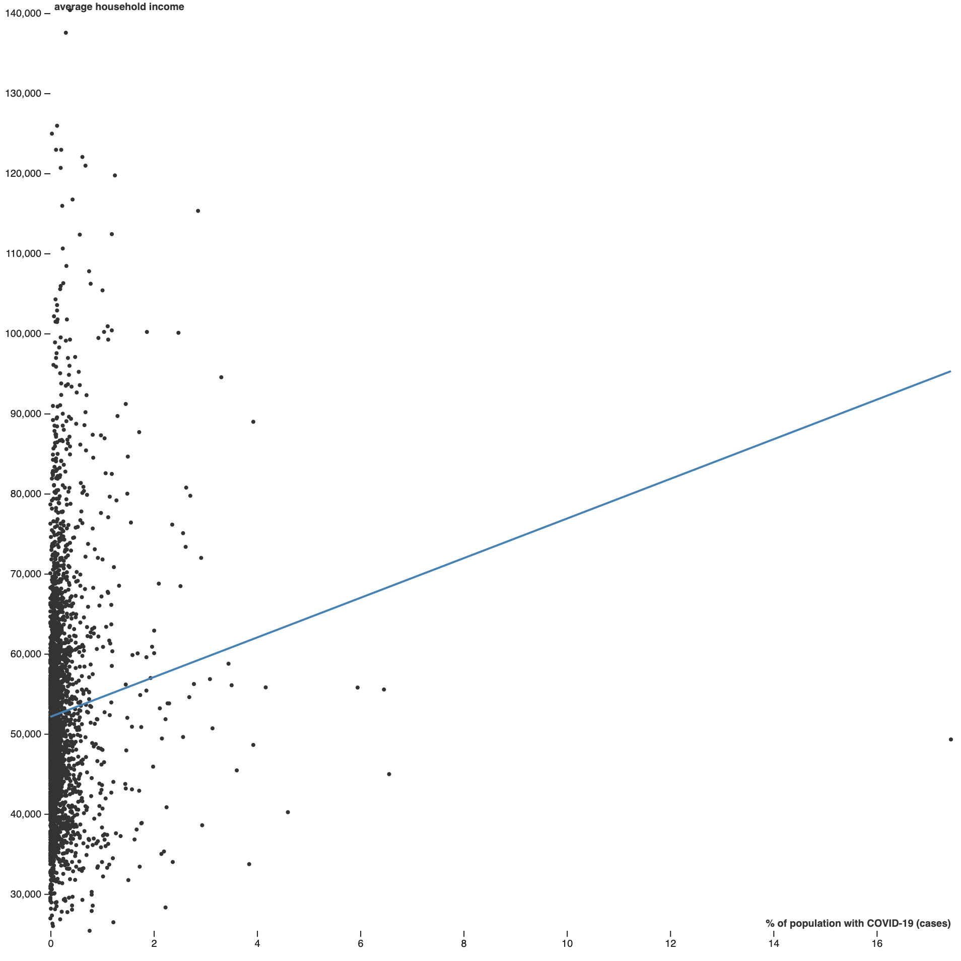
Scatterplots are used to visualize the relationship between two variables. Scatterplots are read from left to right to understand how one variable can affect the other. If the line increases from left to right, the scatterplot indicates that there is a positive correlation between variables; therefore, as one variable increases so does the other. If the line decreases from left to right across the scatterplot, there is a negative correlation between variables; therefore, as one variable increases, the other decreases. Points that don't seem to follow a linear pattern have a weak correlation or no correlation at all. These scatterplots are used to display the relationship between COVID-19 cases recorded from January 22nd to May 13th, 2020, and four different vulnerability factors by county in the U.S.; percent black population, percent elder population, population density, and avergae income. The trends displayed in the scatterplots can be used to understand what demographics are most at risk and therefore should recieve extra consideration when developing public health policies to increase protection of these populations.

Vulnerability Factor: Black Population

Black populations in the U.S. are one demographic group that has shown to have disproportionately high rates of COVID-19 cases. Genetics are not responsible for explaining this trend, but rather societal processes that make black populations more likely to get the virus. The scatterplot displays a general trend of positive correlation between variables, indicating that as percent black population in a county increases, so do the number of COVID-19 cases. Click on the scatterplot for more information!

Vulnerability Factor: Elder Population

Another vulnerability indicator to COVID-19 has been elderly populations. Studies have found that older populations have higher rates of COVID-19 cases due to weaker immune systems and pre-existing health conditions. The trend in this scatterplot displays a negative correlation, indicating that COVID-19 cases actually decrease as elder population in a county increases. However, these results are most likely due to the spatial distribution of elders because counties with high COVID-19 cases are generally densily populated areas where elders do not live. Click on the scatterplot for more information!

Vulnerability Factor: Population Density

Trends showing high rates of COVID-19 cases appear in areas with greater population densities, such as New York City, due to large numbers of people living in a confined space, which encourages the spread of the virus. This scatterplot displays a positive correlation between variables, indicating that as population density increases, so do the number of COVID-19 cases. Click on the scatterplot for more information!

Vulnerability Factor: Average Income

Another vulnerability factor to the COVID-19 virus has been income. Patterns of high COVID-19 rates appear in low-income areas due to the inability to access to medical care, lack of hygiene, and poor nutrition. The trend in this scatterplot displays a positive correlation, indicating that as average household income increases in a county, so do the number of COVID-19 cases. However, this trend can be explained by high COVID-19 cases occuring in cities that generally have higher average incomes. Click on the scatterplot for more information!