Flow Mapping Migration in Peru

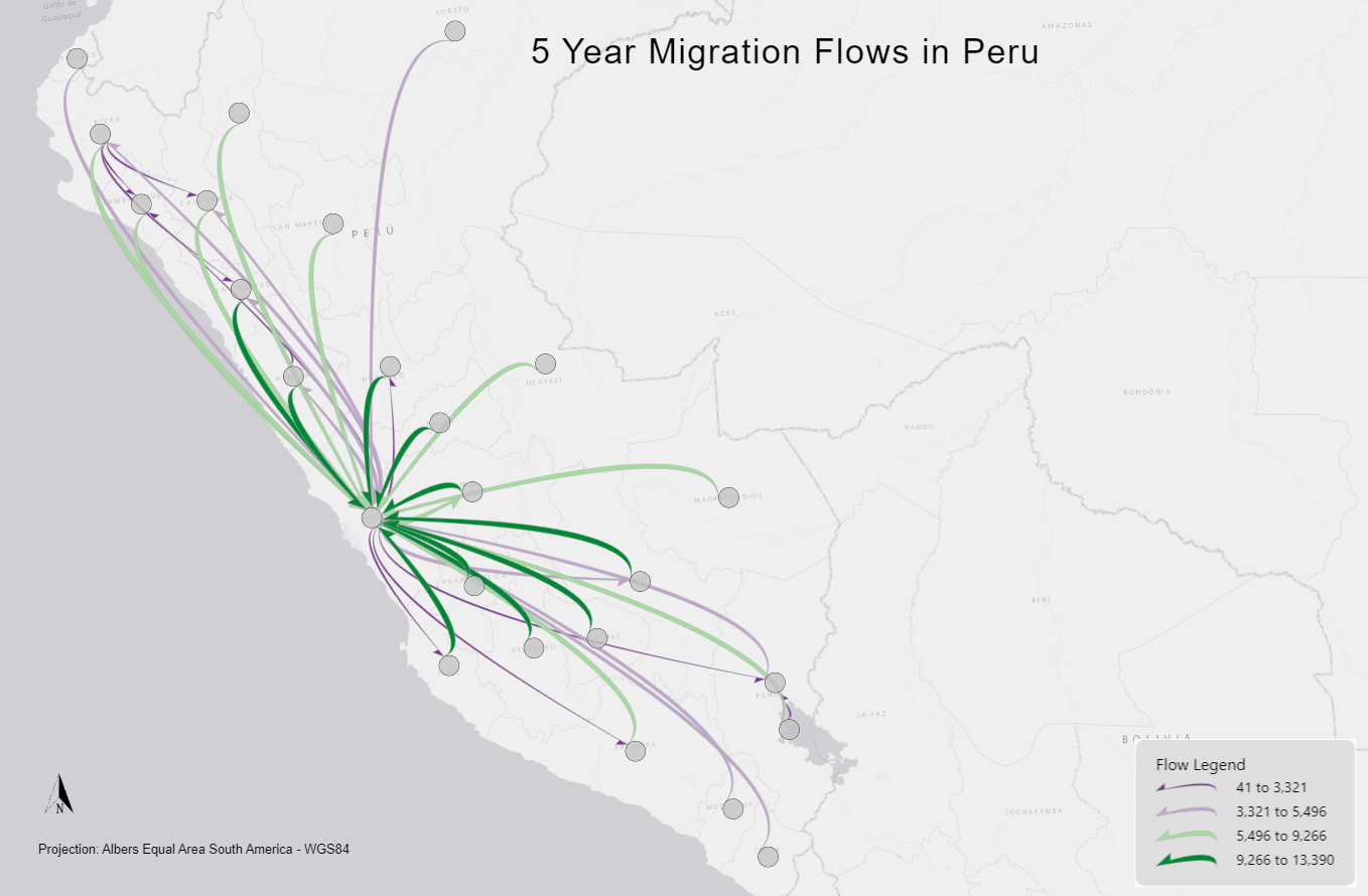
1) Justification of your flow map design: My flow map shows the top 40 migration flows in Peru over a 5 year time period. The flow lines I used are curved half arrows, using line width and a diverging color scheme to display these flows, where darker green represents a higher volume of flows and dark purple a low amount of flows. I used quantile classification for the flow weight with 4 total classes, this let me display the high flow with 2 colors and low flows with 2 colors that I think make the map easier to visualize. I used these colors in contrast with the gray basemap. For the nodes they are displayed as a centroid of the cities using a gray color with a thin black outline to distinguish from the background while distracting from the flows. Because of how many flows to one location there were I had to only use the top 40 or else it would have felt way too cluttered with too much overlap. Also to help with this I used a light gray outline for the flows, with a black outline the map looked too cluttered with that large amount of flows going to one area.