Migration Flows between Regions (1901-1924)
Project link
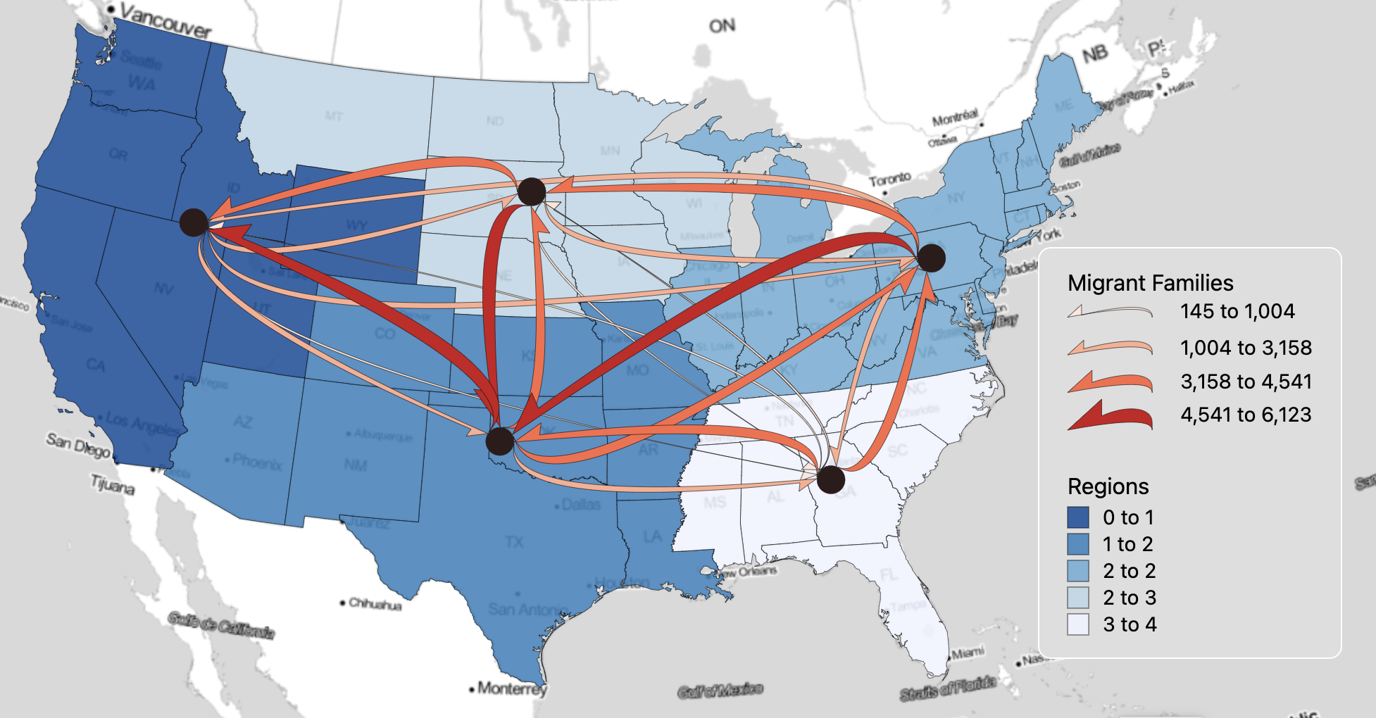
Visual variables description
This flow map shows the migration between migration regions in the U.S. from 1901 to 1924. In this map, my primary objective is to depict the direction and volume of flows between migration regions. I utilized Monotone Arrowhead (MA) as the visual variable for the flow lines, as this variable excels in representing the magnitude of flows and their direction. Interpretation of the direction is both quick and precise, as I am using the half-arrow. Moreover, this variable accurately display the destinations receiving more flows. Although I could use color hues for the flows, I chose to use proportional gray color for them because the regions and proportional points are already in color. This approach emphasizes the flows and enhances their illustration in the way that the flows are highlighted.
Based on the spatial scale of the data, which is at the national level, the classified flow thickness and color values using natural break classification effectively demonstrate the volume of flow and their differences. The data I used contains only 20 flows. The map is easily readable, and the flow lines are clear, so there is no need to remove any flows, as I aim to display all the various volumes of migrations between regions.
For the base map, I employed Stamen Toner Lite Map in the Albert equal area U.S. projection. The map covers the United States, and this projection is one of the best for the U.S. Additionally, my region map consists of migration areas, and I aimed to display the states located in each region using the base map, including the boundaries and names of the states.
The geographical units in this map are based on five migration regions. The states within each region have the most interaction in terms of migration with one another. However, flows between the regions still occur. Each region is shown in a different color. In fact, there are no classifications, but the equal intervals method is the only one that displays the five regions.
The nodes are situated in the centroid of each region, and the proportional circles indicate the gross migration for each region. The gross migration represents the sum of immigrants and outmigrants and can reveal the regions with the highest and lowest changes in population. Additionally, the proportional circles for the nodes further emphasize the thickness of the flow arrows, as the origin and destination of thicker arrows should be the nodes with higher gross migration.
Spatial Pattern
Overall, the map illustrates a balanced migration throughout the U.S. between 1901 and 1924. Nearly all regions both receive and send migrants and have direct interactions with each other. However, the highest volumes of flows are directed toward the west and south. States in southern regions, such as Texas, Alabama, Colorado, and Kansas, both receive from and send to other regions. The map also displays the nodes with the highest gross migration for the southern states.
It seems that the Great Plains experienced a relatively balanced migration pattern, as they both sent and received flows from other regions, particularly receiving from the east and south and sending to the west and south. Western states like California, Oregon, Washington, and Utah welcomed migrants from all other regions, especially from the south and Great Plains. The volume of migrants whose destination was the western region exceeded those who migrated from the west.
Additionally, the Northeastern region exhibits minimal gross migration, but the flows indicate that these states send more migrants to the west and south. Conversely, the lowest amount of gross migration is for the Southeast regions, where states such as Florida, Georgia, and Alabama are located. Although this region receives migrants from the northeast and south, the outflow thickness demonstrates that this region primarily sent families to other regions.